By Philip Bump • Washington Post
 During Tuesday night’s Republican debate, Gerard Baker, editor in chief of the Wall Street Journal, posed a question to Sen. Rand Paul (R-Ky.): “Does it matter at all that the gap between the rich and everyone else is widening?”
It does, Paul replied. And then he pointed a finger.
“I think that we ought to look where income inequality seems to be the worst. It seems to be worst in cities run by Democrats, … states run by Democrats and countries currently run by Democrats,” he said.
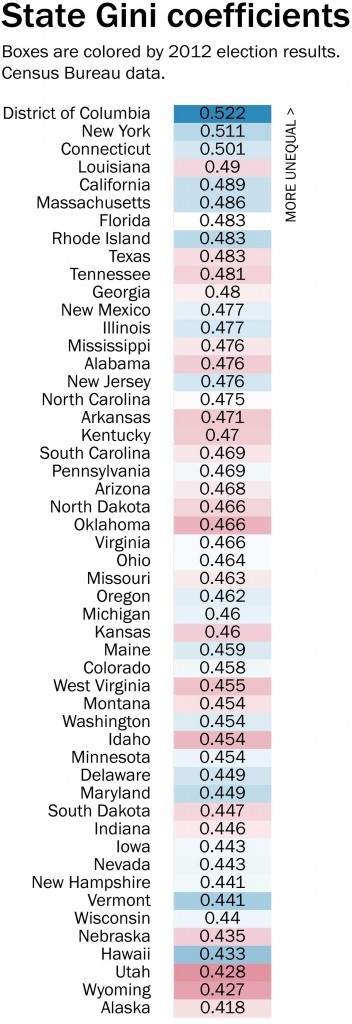
Data from the Census Bureau suggests that — at least on the states — he’s correct. (Since most large cities are run by Democrats and only one country has a Democratic leader, we’ll set those aside.) At right is a chart showing each state’s Gini coefficient in 2014, from the Census Bureau.
The Gini coefficient ranks the income inequality in a place on a scale from zero — no inequality — to 1, the maximum level of inequality. We’ve colored the boxes containing the Gini number by the 2012 margin in each state (or D.C.) to give an at-a-glance sense of the blue and red states. Paul’s point was less about presidential results and our traditional measure of red and blue than state legislatures, but for our purposes this metric gets to the same point.
The top three locations are D.C., New York and Connecticut, all undeniably blue. At the bottom, Utah, Wyoming and Alaska — all red.
But then it gets more complex. The fourth-most unequal state is Louisiana, the governor of which appeared in the debate before Paul’s. And the fourth-least unequal state is Hawaii, where the Democrat who runs this country was born and where that party dominates.
And beyond the fact that six of the eight most unequal states are blue, there’s actually not much of a link between Gini coefficient and how strongly Democratic the state is — or, for that matter, between the percentage of total income held by the top 1 percent in a state, which we can see thanks to data compiled by Mark W. Frank. (The correlations below: 0.13 for Gini; 0.01 for income held by the top 1 percent.)
The point about the income held by the top 1 percent is an interesting one. How you define inequality can vary. For example, Baker used the example of CEO versus worker salaries — a different metric than Gini coefficient.
Using Frank’s data, we plotted the amount of income held by the top 10, top 1 and top 0.1 percent of each state over the past century. In 2012, the states with the highest and lowest amount of their incomes controlled by the richest subset differed depending on where you drew that line.
Paul’s point was a political one, obviously, and while factually accurate, it doesn’t tell us much about why inequality exists and (as you can see in the above graphs) is growing. Paul moved on to that, blaming the Federal Reserve, in part. But then he circled back:
“[T]he bottom line is, if you want less income inequality, move to a city with a Republican mayor or a state with a Republican governor,” he said to applause.
It’s not quite that simple.